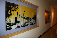
It's easy to lose the feel of Place when having to modernize a building as thoroughly as we had to overhaul the 100-year-old Bright Center. But we were determined to create a place that celebrated the past, while embracing the future. One of the ways we did this was through art.
We took digital photos of some of the most well-known and visually distinctive buildings in town -- the Handley Library, Town Hall, the Fire Hall, Snow White Grill, etc. -- and Mind & Media's graphic artists turned them into 4'x5' canvas paintings, which we framed and mounted in advantageous spots in the common areas throughout the building. We also purchased art from local artists and shops to decorate the foyers and office areas. And we created a wide variety of other Winchester-specific scenes through digital pictures, enhanced in PhotoShop and then blown-up and printed out at local print shops. All this art took into consideration the Bright Center color palette, which came from the purple and gold logo we created.
Three years later, people still walk through the building just to see the paintings and local art, particularly those of their own building or shop. Our staff is proud to have helped create and brand Bright Center, the construction crew is proud of their contribution (more later), and residents seem to be flattered at our unique spotlight on their city. I believe that through embracing Place, it's easier to capture the hearts and minds of those involved in making project's successful, and perhaps that is the central reason for doing it. (Marilyn Finnemore)


2 comments:
Who did the artwork?
The artwork was done by a variety of our in-house people: Troy Thompson, Chris Ammon, Lindsey Kesecker. They're all very talented!
Post a Comment